related project

Project Vitality

Project Vitality is a mobile app that aims to make healthcare easier for both physicians and patients with the use of AI. My roles on this project were UI/UX design, prototyping, and branding.

Date

June 2024 (1 week)

Tools

Figma, Figjam

The Team

1 Product Designer
01. the problem

Getting healthcare that you deserve shouldn't be difficult or confusing.

Accessing healthcare is challenging for many due to geographic disparities and the complexity of the system. Not only are the correct medical facilities often inaccessible for those who live in rural areas, finding the correct help can be confusing even for the average city-dweller. This not only leads to delays in treatment, but also negatively impacts health outcomes. By creating a streamlined system that supports both patients and physicians, we can make healthcare more accessible and manageable for everyone.

02. our solution

Designing a system to make healthcare easier for both physicians and patients.

This project was a last-minute undertaking for a pitch competition. The goal was to create at least one happy path for a patient signing up for the first time. To achieve this in a week, each stage of the project had to have specific time limits.

1

Research

intitial requirements
competitor analysis
new requirements

2

Synthesis

user personas
user flow

3

Visual design

visual branding
low-fi sketches

4

Final designs

design system
hi-fi designs

03. research

Initial Requirements (Client)

UX

As a physician, I want to be able to see all my scheduled appointments, both virtual and in-person, in one place.

As a physician, I want AI to analyze my virtual appointments and provide me with notes.

As a patient, I want to be able to schedule virtual appointments.

As a patient, I want to be able to filter doctors by location.

UI

As a user, I want to see a clean and simple UI.

As a user, I want a easy and minimal navigation that can be used by the non-tech savvy.

Competitive Analysis

Our exact product hasn't been attempted before, since putting healthcare online and mixing it with AI are both fairly new ideas. We decided to examine two applications which attempted to make healthcare available online, without an AI component.

Practo

Unique value: exclusive to India; offers symptom-based search options, verified doctor reviews, cost estimations of common procedures, and forums with expert responses.

+

Pros

User-friendly interface: Practo uses a combination of cohesive graphics and simple layouts to make an easily navigatable interface.

Shortcut to specialists: Through features such as expert-answered forums and filtering by symptoms, patients are able to connect directly to specialists.

Search by symptom or condition: Patients can find specialists even if they are unsure of their exact condition, without the hassle of seeing a general physician first.

-

Cons

Could be overwhelming: Practo uses several different font sizes and colours, which could be confusing for older generations.

Rocket Doctor

Unique value: exclusive to Canada (ON, BC, AB); connects directly to your insurance, upfront about costs

+

Pros

Simple happy path: Rocket Doctor makes it easy for the user to reach the happy path, with a very simple and direct procedure to appointment confirmation.

Doctor collaboration: Instead of going through healthcare providers, Rocket Doctor connects you directly to doctors who can collaborate and manage the user's healthcare.

-

Cons

Could be overwhelming: Rocket Doctor uses even more different font sizes and colours than Practo, which could be confusing for older generations.

Difficult to navigate on mobile Rocket Doctor does not offer a mobile application, operating only from their website, which is difficult to look at on mobile.

Limited services: Patients aren't able to reach specialists directly, instead choosing between the type of service (text, call, video call, or in-person).

New Requirements

UX

NEW

As a younger patient, I want to access my healthcare through a mobile app, which can be more complex than the website.

As an older patient, I want to access my healthcare through a website with a simple happy path.

As a user, I want the option to choose between a virtual and in person appointment at the top of the home page.

As a user, I want to see a section for the most common symptoms on the home page.

UI

NEW

As a user, I want to see less text and less bright colours.

04. synthesis

User Personas

Based on the competitive analysis, and further discussions with the client, I made two user personas; an older user living in a more rural area and a younger user from a city.

Da Kim, 61

Welland, ON
Retired teacher

A retired teacher who values independence, Da needs semi-regular health checkups, but mobility and transportation issues make trips to her specialist difficult. After adjusting to a virtual environment during COVID, she seeks a virtual solution to reduce the need for frequent travel.

Pain points: hard to remember checkups times, physical fatigue from travel, limited access to healthcare without in-person visits

William Li, 20

Toronto, ON
University Student

William moved to Canada from China for university, and has little knowledge of the healthcare system. As he has severe allergic reactions during allergy seasons, he is looking for an easy way to schedule appointments with specialists and organize them in one place.

Pain points: little knowledge of Canadian healthcare system, needs recommendations for allergy specialists

User Flow

In order to translate the desired requirements to the actual application, I created user flows. These flows were approved by the team before proceeding.

05. visual design

Visual Branding

Due to needing to create other brand material for earlier deadlines, I decided on the branding earlier on. The client wanted a clean image with some playfulness incorporated. I'll dive further into the design choices in the design system section.

Click the button below for more graphics.

related project

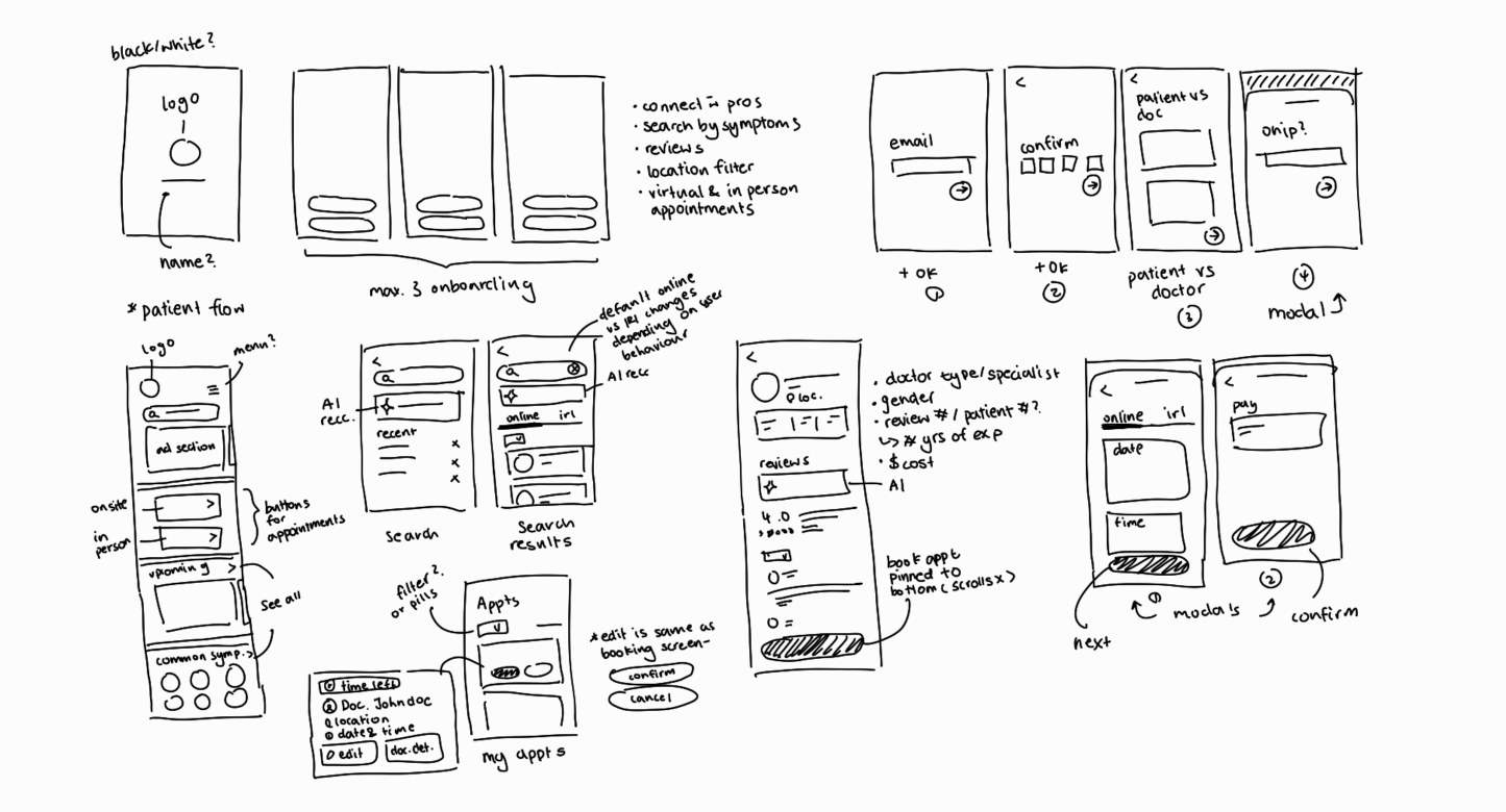
Low-fi Sketches

Although I ended up creating a few more screens, because I finished the other pages earlier than expected, these were the early versions of the screens we deemed necessary for the patient's happy path.

07. final designs

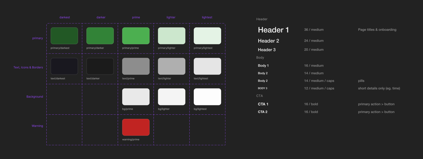
Design System

Primitives

Green seemed like the obvious choice for the main colour, as it is commonly used to symbolize 'life' or 'vitality.' For typography, I was looking for a clean, sans-serif font, with a bit of personality, based on the app's brand.

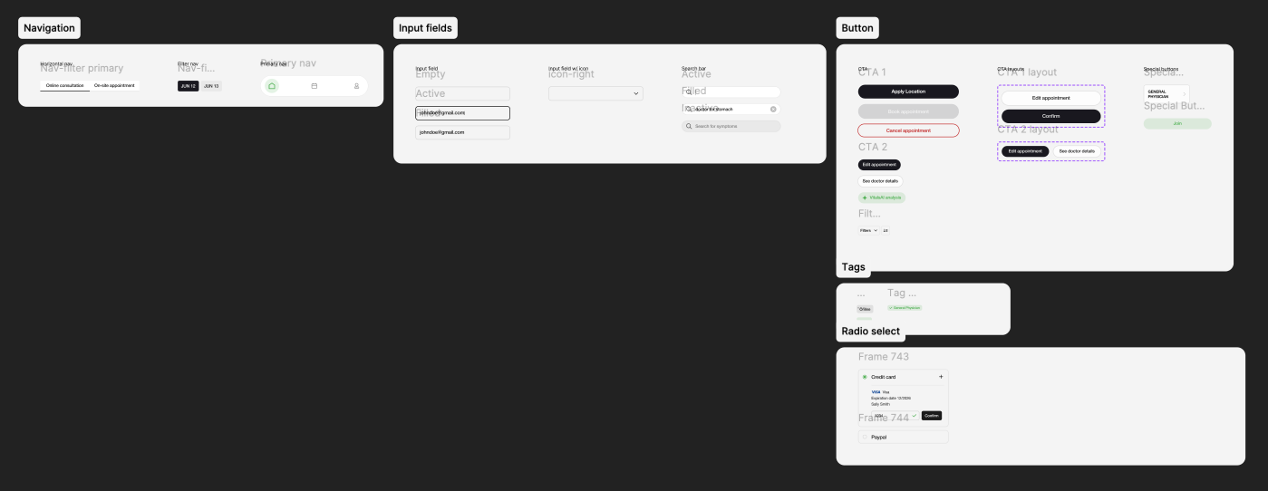
Components

The component library is still a work in progress- this project is currently on pause until I have time again (spoilers!).

Hi-fi Designs

Miscallaneous Screens

These are screens I designed for stakeholder presentations, but were not part of the happy path prototype.

The Happy Path Prototype

07. retrospective

Key Takeaways

1

Ordering by Importance

Focusing on accessible and simple navigation meant every detail mattered. Information architecture made a huge impact.

2

Feedback

Knowing when to ask for feedback and incorporating it iteratively on a tight schedule was hard.

3

Developer Communication

Time constraints meant I was designing while the developers were implementing. Real-time communication is something I need to work on.

4

User vs Client

Aligning the client's goals with user satisfaction will be pivotal, especially moving forward with user tests.

Next Steps

Although this app didn't win the pitch competition, we were able to get several parties interested. I'll be working on this app further once I'm finished my school term.

1

User Tests

Due to the time crunch, and because it was for a pitch competition, I didn't prioritize user tests. However, moving forward, I want to incoroporate as many user tests as possible- both moderated and unmoderated.

2

Website

The mobile app was just the MVP- I recognized a website would be pivotal to the success of this project during competitive analysis.

3

Physical Product

I hadn't mentioned it before, because it's still in very, very early planning stages, but the objective of this project is to de-centralize hospitals. A physical product is being made to replace physical consultations.

4

International

We want to make healthcare easier worldwide. This will be a huge undertaking, but something I'll keep in mind moving forward.