This project was the final project of SYDE 162, a humans interactions and design course. The team designed a tool that in order to make campus navigation efficient, using built-in navigation systems and schedules. My roles for this project were UI/UX design, prototyping, user testing, and branding.
The lack of seamless integration of an outdoor campus map and indoor floor plan.
The current system of locating classrooms at the university often requires the usage of static, inconspicuous floor plans, whose unintuitive nature leads to students getting lost and wasting time using inefficient routes.
There are so, so many pain points. Users often use applications such as Google Maps to locate a building. However, location markers are often placed in the middle of a building which may not lead users to a particular entrance or the closest one to their desired room, especially in larger, more complex buildings. Upon entry of a building, to locate a room, users typically have to read static, confusing floor plans scattered inside. For convenience, there are several food vendors run by UWaterloo on campus. However, most lack reviews and their restaurant descriptions are biased for advertisement purposes.
Some study areas may be better than others, for instance, several of the desk lights in the Peter Simms study area of Davis Centre do not work, leading to students being inconvenienced searching for a suitable spot. There are areas on campus which are not wheelchair-accessible, but widely used map applications do not have a feature which filters routes down based on accessibility needs or weather conditions.
02. our solution
Create a navigation system accessible to all members of the campus community.
03. research
Initial Requirements
Instant navigation feature to a specific location or to a friend
“Friending” system, where users can choose to have their location shown to others
Rating system where fellow users can rate study spots, classrooms and eateries
Onboarding screen with authentication for security purposes
Search bar and route filter with options to select fastest, indoors, or wheelchair-accessible route
Campus map seamlessly integrates with building floorplan to lead users to a specific room in a building
Unmoderated Survey
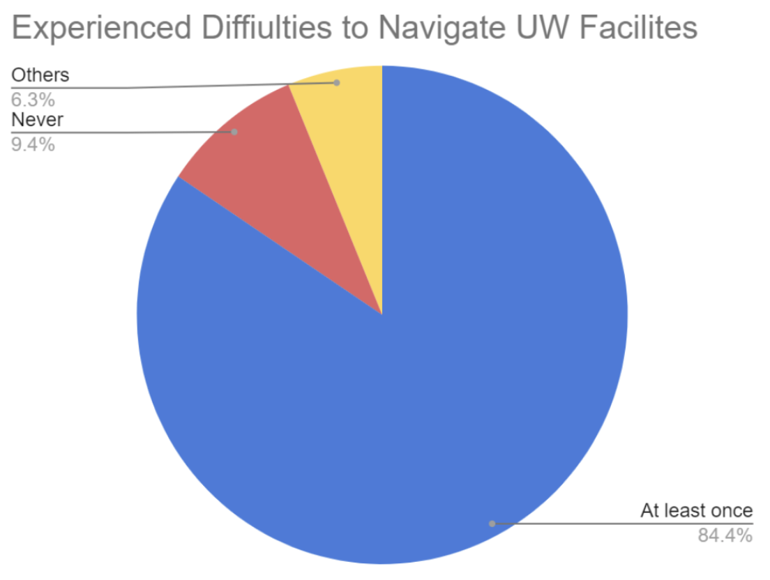
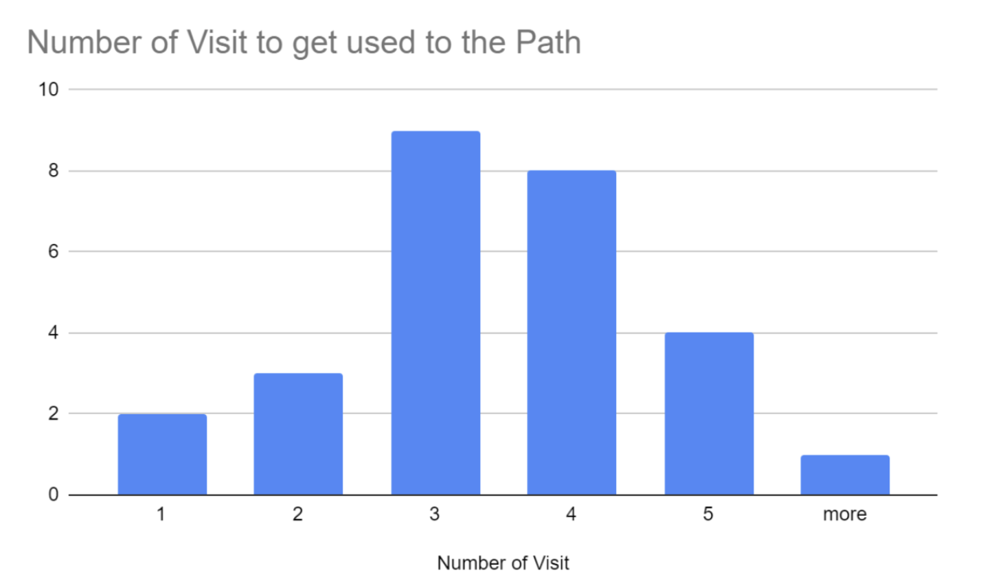
Our group created a survey, consisting of 32 students/users, to seize their inconvenience while navigating around the UWaterloo campus. The pie chart of the survey results shows that 84.4 percent of users experienced difficulties at least once while navigating to UWaterloo facilities. Among them, as the bar graph on the right represents that most users answered that they need to visit the same place three or more times before they become accustomed to the route.
Moderated User Tests
From the moderated user test, we saw that we emphasized with the users through identifying our initial pain points, which will be addressed in our design. Having both preliminary questions and testing prompts allowed us to gain a first-hand perspective in order to effectively design our mapping application. An issue that was raised by a participant was that Google Maps’ default route through campus involved going up a set of stairs and did not have a wheelchair-accessible option.
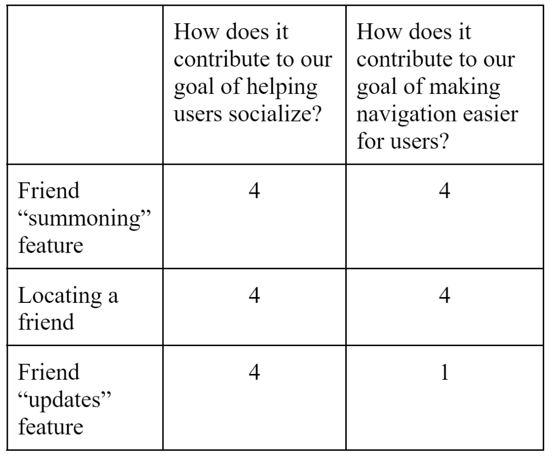
Decision Matrix
Our decision matrix shows three of our friend features and the thought process we endured when deciding whether to keep them. We used two metrics: how the design would improve our socializing and navigation goals.
For both the friend “summoning” feature and the locating a friend features, they were at a “4” for the metrics, thus we decided to implement them. For the “update” feature, it also helps users socialize but does not really contribute to making navigation easier for users. We ultimately decided on keeping this feature as we believed it is an integral part of our design, promoting more use of the application and initiating more navigation requests.
04. design system
Palette
A bright, cheerful teal was chosen as the main colour to make the app stand out, as well as to make the overall experience more enjoyable.
Typography
I chose a single, sans-serif font to reflect the simple aesthetic and casual nature of the app.
Components
Although we were pressed on time, I still believed that creating a strong design system would be worth it; here are some of the most frequently used components, as well as iconography!
05. Retrospective
Key Takeaways
This was the first time I tried designing an entire application without other UX designers. It was a very eye-opening experience, and I realize it's a lot more work than it looks like.
If I could improve on anything next time, it would be to create more components so the app could be more cohesive to a new user. The process was very smooth sailing otherwise- considering it was due the week before finals, I'm very pleased with the result.
i’m looking for a job in ux.. 4 months.. co-op.. winter..